

PROJECT
Bringing a Wisconsin supper club to life in Chicago through brand identity, copy, and event direction that turned a nostalgic concept into a real dining experience.
ROLE
Creative & Art Director, freelance
COMPANY
Odd Tails Super Club
STAKEHOLDER(s)
Chef & Founders
SCOPE
-
Brand strategy and creative direction
-
Logo design
-
Color palette
-
Typography
-
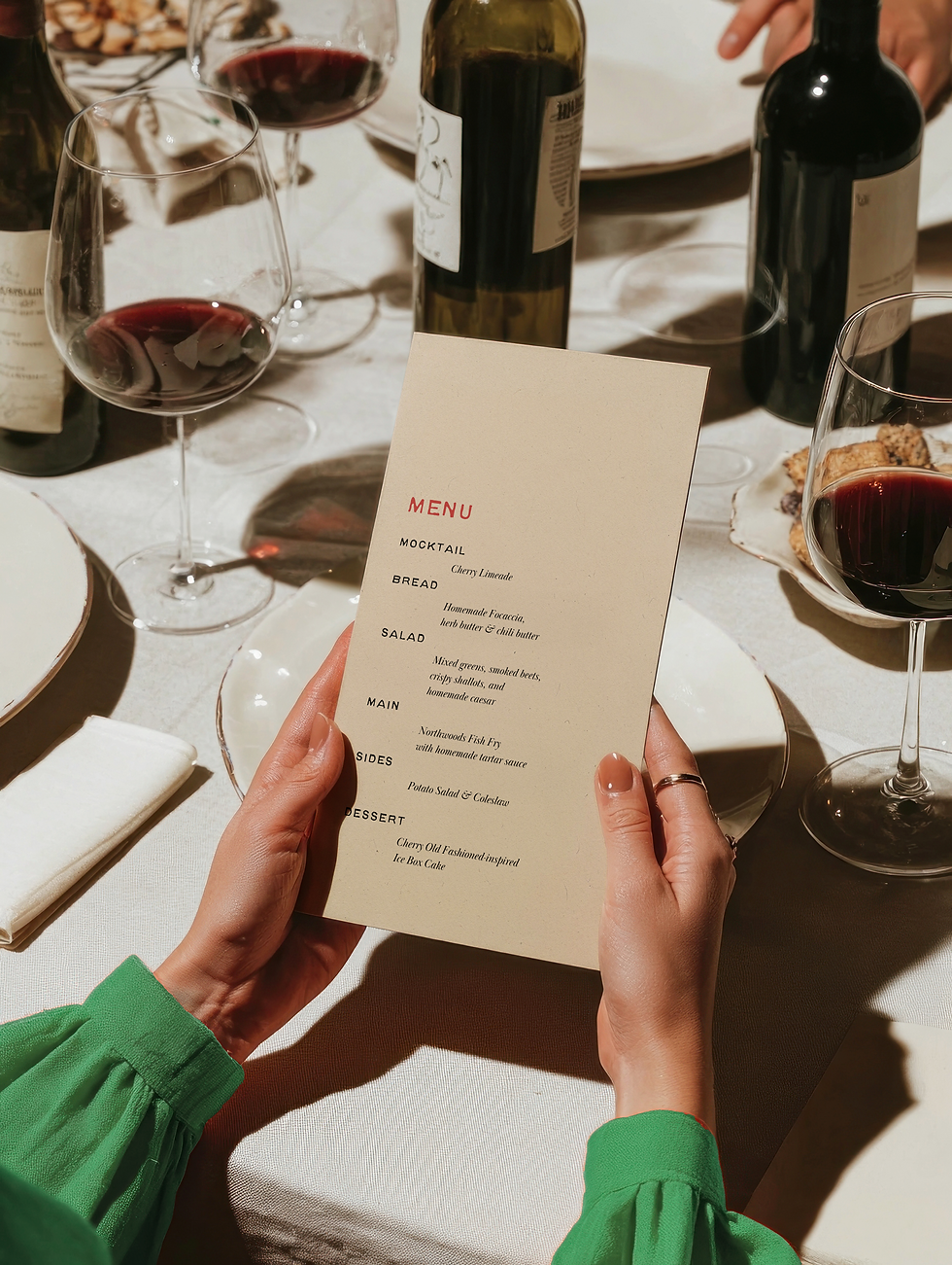
Menu & signage design
The Brand Build
Odd Tails is a social-forward supper club in Chicago, run by chef Justen Lambar. Rooted in the tradition of a classic Wisconsin supper club, it brings family-style, three-course dinners to intimate, unexpected spaces on Thursday and Friday nights.
The vibe sits somewhere between a dinner party and a cabin in the woods: warm light, low music, shared plates, and mocktails that keep the evening going.


The ask was to build the brand from scratch: logo, color, typography, menu design, and social media assets.
Moodboard and Creative Approach
Odd Tails is a concept with a lot of personality baked into its name and its story. The creative challenge was finding a visual language that could hold all of it without over-explaining it.
The direction I landed on was clean and editorial. Supper clubs and intimate dining concepts often lean heavily into darkness and texture, moody photography, hand-drawn type, rough materials. That approach can feel expected. For Odd Tails, which is genuinely playful and story-driven at its core, a cleaner editorial direction gave the brand more room to breathe and let the concept speak for itself.
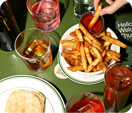
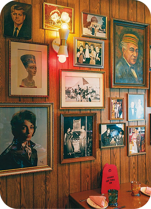


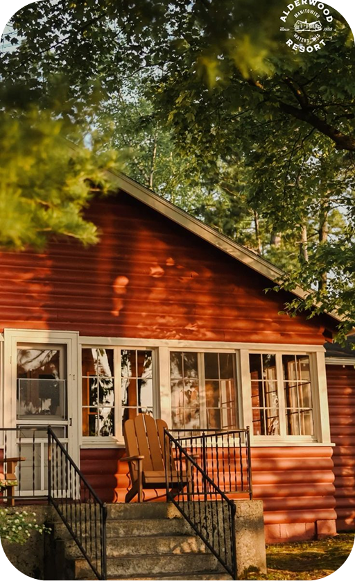
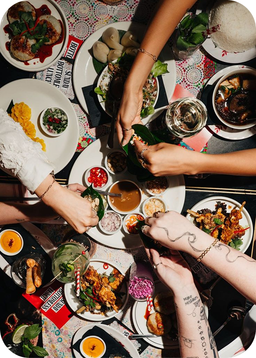
The goal was a brand that felt considered and deliberate, the kind of visual identity that tells you the food and the experience will be equally well put together, without trying too hard to signal that. Warm without being rustic. Refined without being cold.
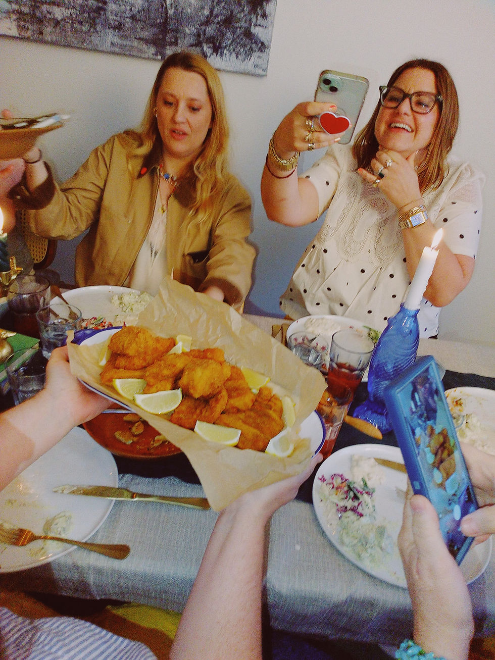
Tails is a call out to the fish, because a Friday night fish fry is the heart of any good Wisconsin supper club and we take that very, very seriously!

The name comes from a few places:
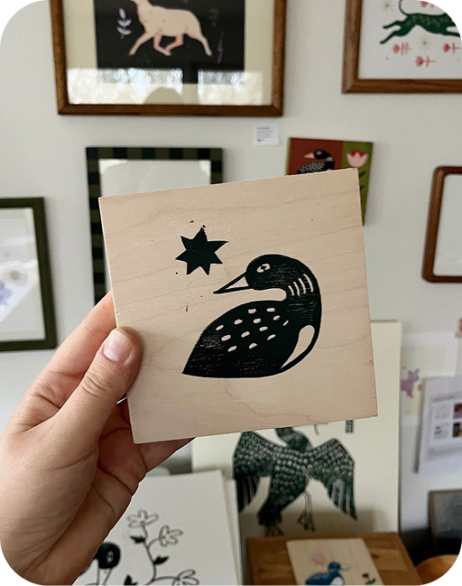
Loons were the original spark.
They’re the opposite of a morning bird, something that belongs to the night and the water and the quiet end of the day. A more than subtle nod to Wisconsin.
And then there are the tales, the ones that only come out once the food is gone and nobody’s reached for their coat yet.
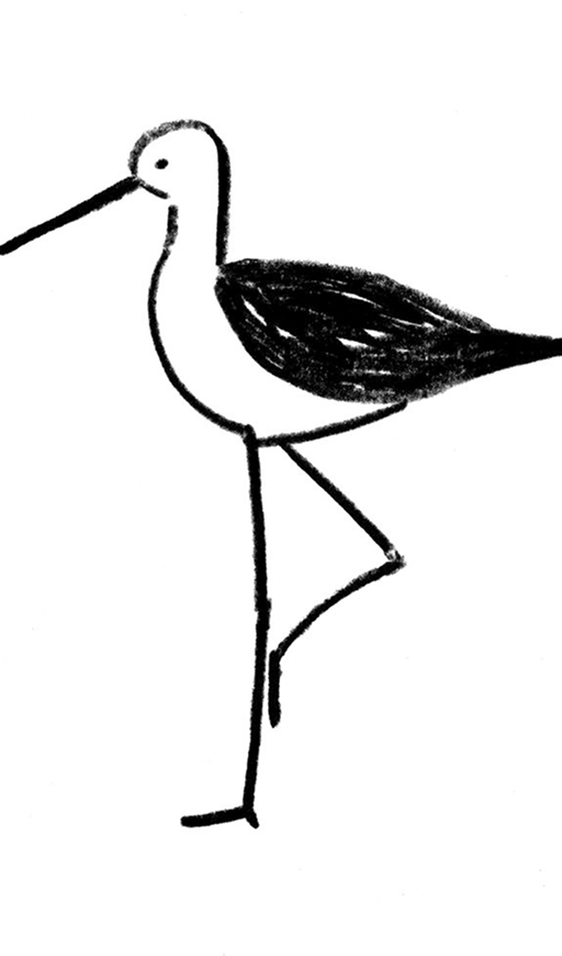
The loon as a visual element was a natural anchor for the identity, carrying the Wisconsin reference, the nocturnal quality of the supper club format, and a quiet elegance that fit the editorial direction well.
Logo and Branding
Logo development centered on finding the right expression of the loon that could carry both the warmth of the concept and the cleanliness of the visual direction. The mark needed to work across a range of applications: on a printed menu, in a social post, on signage in an intimate dining space.
Color and typography were built to support the editorial tone. The palette needed to feel warm enough for a candlelit dinner setting while staying clean enough to read well in a social feed. Type choices reinforced the balance between refined and approachable that runs through the whole concept.
#d6b4fc
HEADER FONT
MisPRINT
BODY FONT
Baskerville
#c73934
#edebeb
#000000





#d6b4fc
#c73934

The Results
Odd Tails launched with a complete brand identity built to match the ambition and specificity of the concept. The visual system covers every touchpoint a supper club guest encounters: from the first social post that catches their eye to the menu they hold at the table.
The brand enters the Chicago dining scene with a distinct visual voice that reflects the layered story behind the name and positions Odd Tails as something genuinely different in a crowded intimate dining market.

Role: Art & Creative Director
Scope:
-
Brand strategy and creative direction
-
Logo design
-
Color palette
-
Typography
-
Menu & signage design
Brand: Odd Tails Supper Club
_gif.gif)
Let’s Work Together
Available for creative direction, brand work, and content projects.
Chicago and beyond
© 2026 Nate Crawford Creative. All Rights Reserved.